Rydeen Mobile Electronics is one of the main aftermarket car technology providers of the South Bay in California. WebInke Design has helped expand and redesign their website multiple times since 2018, with each version being more user friendly and including more custom features.
Over time, Rydeen Mobile has added new products and entirely new lines to their inventory, and they wanted an updated way to show visitors how their products work with each other in their own branded “R-ECO” System, and shift the visual focus to highlight other products as well in the process.
This was also a perfect opportunity to rebuild the website and clean up some of the older code and things that we were no longer using.
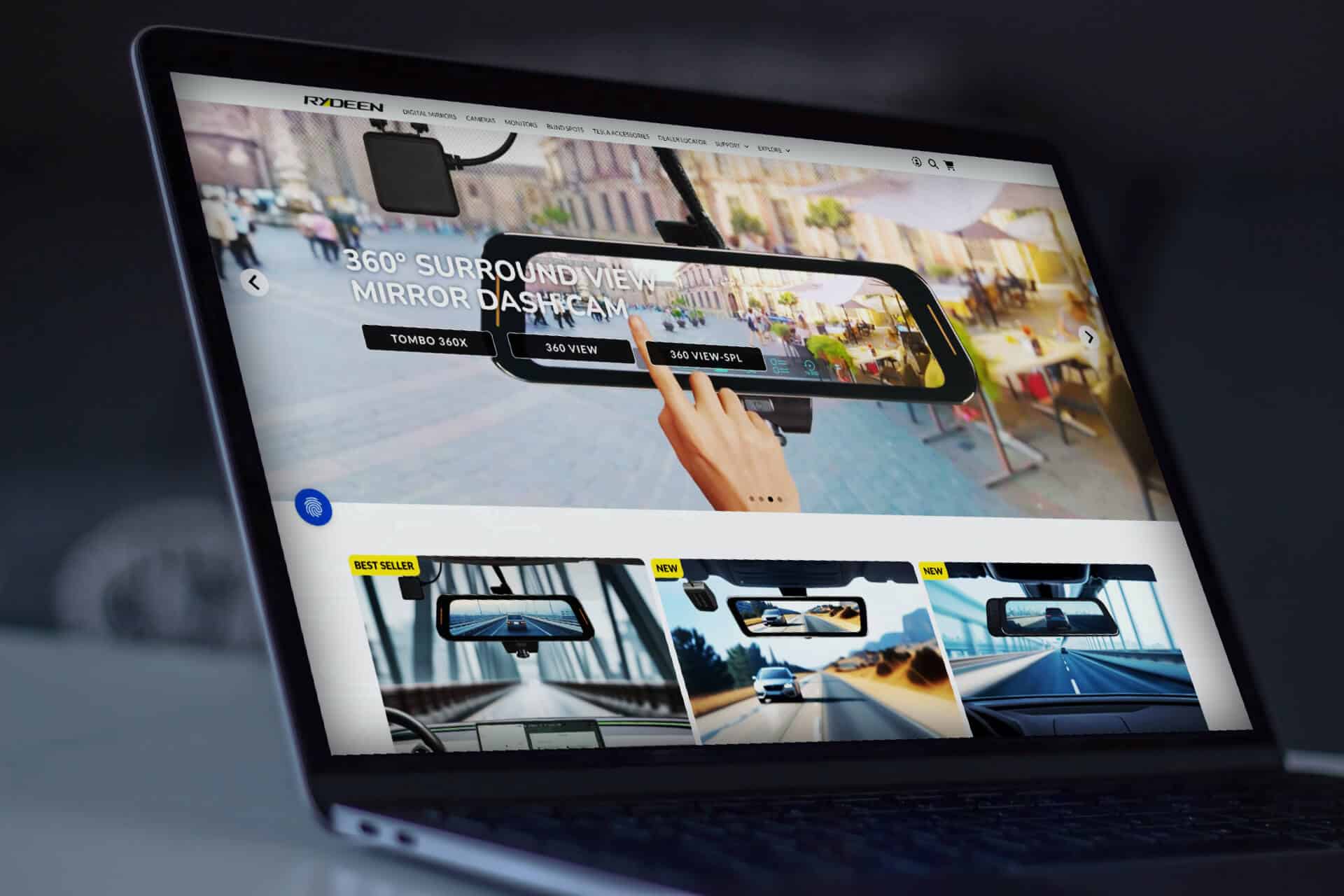
Refreshed Layout
The newest version of the website features a more intuitive navigation experience, complete with direct links to top products categories. We highlighted the top and newest products, so visitors can see right away which products are featured and can click to them easily.
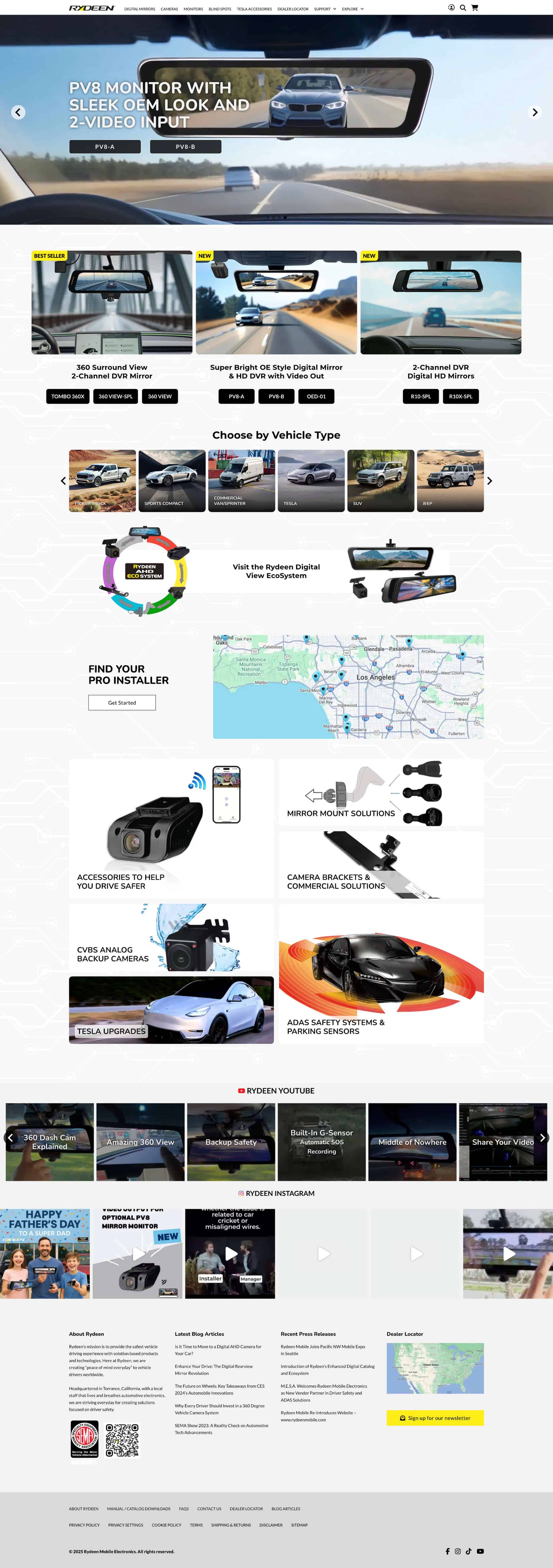
We also adapted a more modular approach to the home page, making it easy to highlight new features and products, and sections can be swapped out much easier.
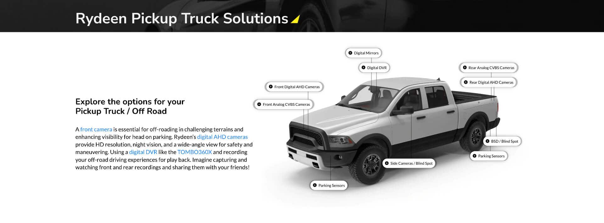
Focus Pages
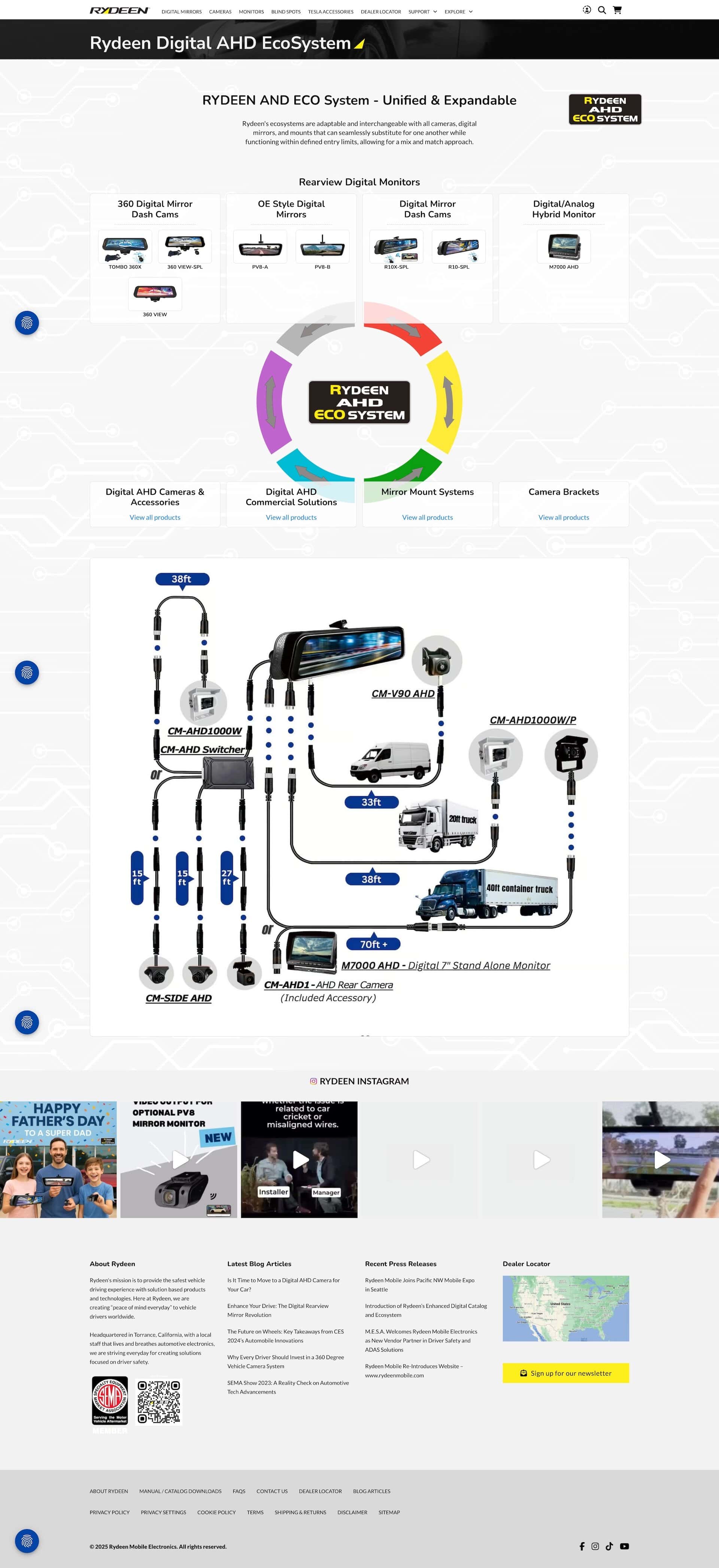
As part of the redesign, we added a series of new pages that are specifically for showing visitors how the “R-ECO” system works. We show a simple interface with a generic vehicle that indicates where each product can be installed, and then we link to those specific categories.
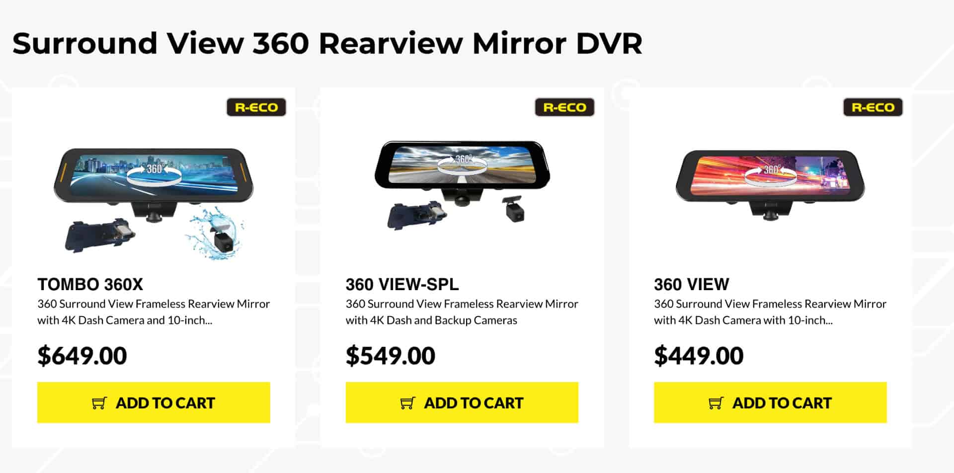
Dynamic Badges
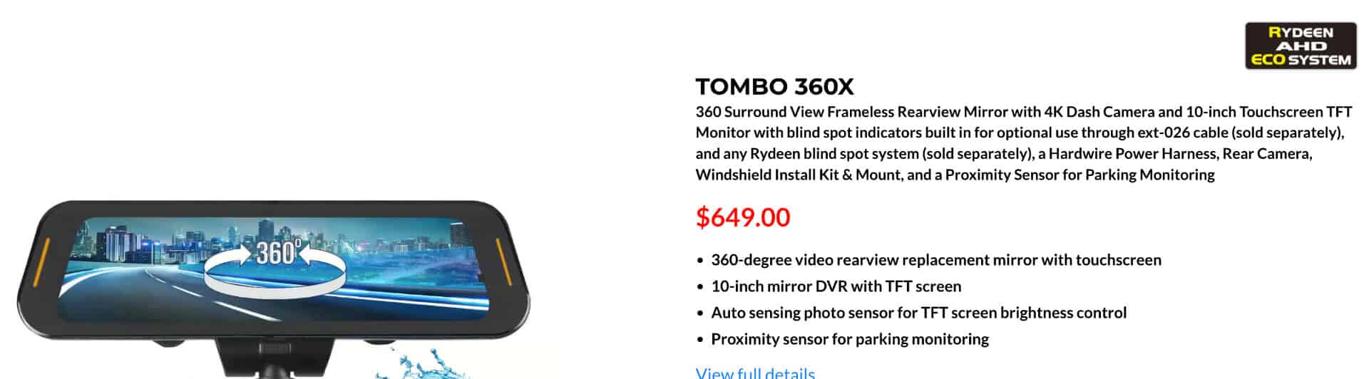
With the introduction of the new “R-Eco” system, we needed an easy way to show which products were part of it. Since the site currently has over 90 active products that span multiple categories, we decided to create a simple conditional switch that can be applied to any product, instead of dealing with exclusions within categories. Each listing page shows a simple badge on the product and the product detail page shows a bigger badge that links directly to the Eco-system detail page.
The Digital AHD EcoSystem page shows exactly how the cameras and monitors interact with the accessories, making it easy for a customer to make a customized package of products.
Mobile View
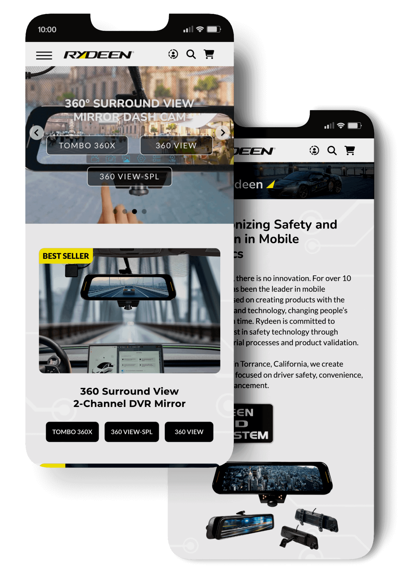
As always we also made sure that the website worked on mobile and tablet devices, to ensure that all users can find what they need no matter where they are. The content is streamlined to make it easy to read all the text and view the images in detail.
Finishing Up
At the end of the day, the focus for the refresh of the website was to make it easier to visitors to find the flagship products quickly and easily. By putting all the information up front and accessible from multiple areas, as well as making clear detail pages about which products work with each other, we’ve seen online sales already pass last year’s threshold at this same point in time.
Ecommerce websites can be complicated and a bit daunting, but with the right plan and tools they become much more manageable. If you’re looking to redesign or develop your own Ecommerce store let’s talk!