For this article I’m going to go through how I design logos, step-by-step. Sometimes I don’t follow this exactly, but more or less this is how I do things. By no means am I saying that this is a right or wrong way to do it, because the simple fact is, there are many ways to do logos. Usually it’s the end result that matters, and whether or not your client is happy with the work you did!
Since I just contracted and finished up a new logo for an existing client, I figured it would be the perfect chance to show what I do. Kay Jasmine Photography decided to branch out her business for women who were looking for Boudoir. If you don’t know what that is, look it up 😉
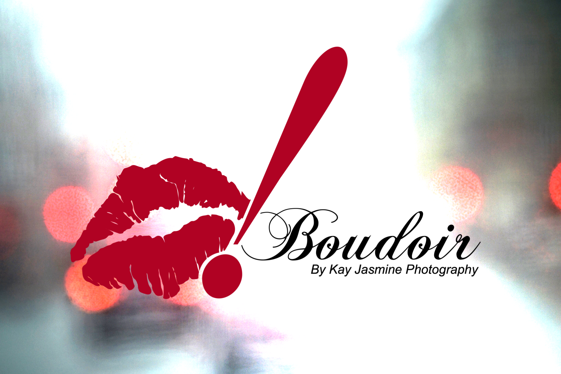
Anyway, because this off-shoot is going in a slightly different direction than her normal photography business, she decided that it needed its own branding (and website eventually). Kay had already decided on a name: O! by Kay Jasmine Photography. The imagery, lips. The only real concern she had was could I make it classy without being cheesy.
Step 1: Collect Samples
First off, I collected samples of lips, or lipstick kisses to be more exact. I had Kay kiss a sheet of paper a number of times and send me the images. I figured the best way to make a convincing pair of lips for her logo would be to use her own lips as the inspiration. This is part of the research phase, and really, how many people get to study a pair of lips and get paid for it? After deciding on the image that felt the most universal, it’s time to move on to the next part.

Step 2: Sketches & Ideas
Time to throw down some loose sketches, just to get an idea for composition and size. At this point in the process it’s all about ideas. Sometimes I’ll draw 2 sketches, sometimes I’ll draw 15. It depends on how solid of an idea I have in my head when I’m starting.

Step 3: Lines and detail
The next step was to create some line work based on the chosen lips, so I printed a large version of the lips, and outlined them with a pen to make the definition stand out more. After creating my outline, I rescanned the lips into Photoshop, and imported the image into Illustrator so I could create a vectorized version of the image. This gives me a resource that is scalable to any degree, and I can always re-import the vector file into Photoshop if I need to.


Finishing Up
Once the adjusted lips were scaled to size, it was a matter of editing them to match the sketch designs. A couple of revisions later and we arrived at the final logo, which made Kay happy, and in turn that made me happy. Since keeping the logo as a vector is always a good idea, I manually shaped the lips and the text around the exclamation point. In photoshop you can erase things you don’t need, but in illustrator it takes a bit more work to think through the logo from start to finish.
Another one for the books!


